
6 Things to Consider When Choosing Paint Colours for Your Home

Putting on a fresh coat of paint is one of the simplest and cheapest ways to transform the look of a home. However, with the endless shades and finishes to choose from, deciding on a paint colour can be the most difficult part.
In 2020, we bid farewell to Living Coral and said hello to Classic Blue as the Pantone Colour of the Year — but don’t just go straight to the paint store to buy several cans of this bold hue! Choosing the perfect colour for your home can be tricky, and formula guides and colour swatches won’t be helpful if you don’t take into consideration some factors involved in your home.
So whether you’re looking to eventually sell your home or simply give it a makeover, keep your paint obsession on hold until you read these essential suggestions first:

1. PAY ATTENTION TO LIGHTING
The light source in the room you are painting can greatly affect the way a colour appears. A certain colour may appear different in a room filled with sunshine, compared to a room that’s lit with fluorescent bulbs. So don’t forget to take lighting into consideration when selecting colours for a specific space.
2. TAKE NOTE OF UNDERTONES AND FINISHES
According to TheSpruce.com, “undertones are the secret code of every colour.” Some undertones are not easily visible unless paired with other colours. The floor, counter surfaces, and even lighting can all bring out surprising undertones from your painted walls, so make sure that the items or the lighting in the room didn’t bring out an undertone that you weren’t intending to.
Likewise, paint colours have varying sheens and finishes, like a matte vs semi-gloss paint. Matte finishes can be cheaper but are less durable, while high-gloss can be easier to clean — so which room you’re painting and how you use it are important factors when selecting paint.
3. COMPLEMENT YOUR FIXED FURNISHINGS
Take into consideration the fixed furnishings in a room — the flooring, wood finishes, countertops, wallpaper, tile, or built-in cabinets — and choose colours that will enhance these materials. As much as possible, you’d want your wall colour to complement the existing colour scheme of the cabinetry and other furnishings, especially in the kitchen and bathroom.
4. CONSIDER YOUR NEIGHBOURHOOD
Putting a fresh coat of paint on your house’s exterior can give it an instant makeover and spruce up curb appeal, which can be a huge selling point for your home. But when choosing a colour for your facade, keep in mind the character of the neighbourhood, especially when you’re living in a condo or townhouse community. Make sure the colour of the exterior will blend well with the landscape surrounding your property and the neighbourhood you’re in.
5. NEVER PICK A COLOUR FROM A COMPUTER SCREEN
Have you ordered clothing or furniture online that turned out to be a different colour than what you saw on the screen? You can blame the computer screen, as colours always show up differently in monitor displays. So if you’re choosing paint colours for your home, it’s best that you don’t rely on what you see on the computer.
Just because walking into your local paint store and selecting a variety of paint chips is no longer an option doesn’t mean that you should buy your paint colours without testing them first! Call you local store and ask if they can put together a selection of paint chips or colour guides for you to pick up, and don’t forget about having a small paint sample mixed so you can try out the colour before you commit to the whole room!
You can even try out colours virtually: once you find a paint colour you like, enter the product code into a Google or Pinterest search to see real examples of the colours on different surface types and room sizes!
Our favourite trick? Download the free ColorSnap app from Sherwin-Williams and use the Colour Visualizer Tool to test out colours on your own walls in real time using your phone’s camera! P.S. Did you know Home Group clients receive an exclusive discount from Sherwin-Williams stores in Guelph? Contact us or your agent to learn more about the discounts we offer our clients as part of our HGR Client Benefits Program!
6. CONSIDER PAINT COLOURS THAT WILL APPEAL TO BUYERS
According to Zillow’s Paint Colour Analysis Study, the colours you choose to decorate your home with can have a powerful impact on the home’s sale price. Their Colour Report showed that the rules and results vary depending on the room type. Although it may seem like a tedious job to paint your house to get it ready to sell, the effort may be worth it. If you have extra time on your hands, now is a great time to start updating your home one room at a time!
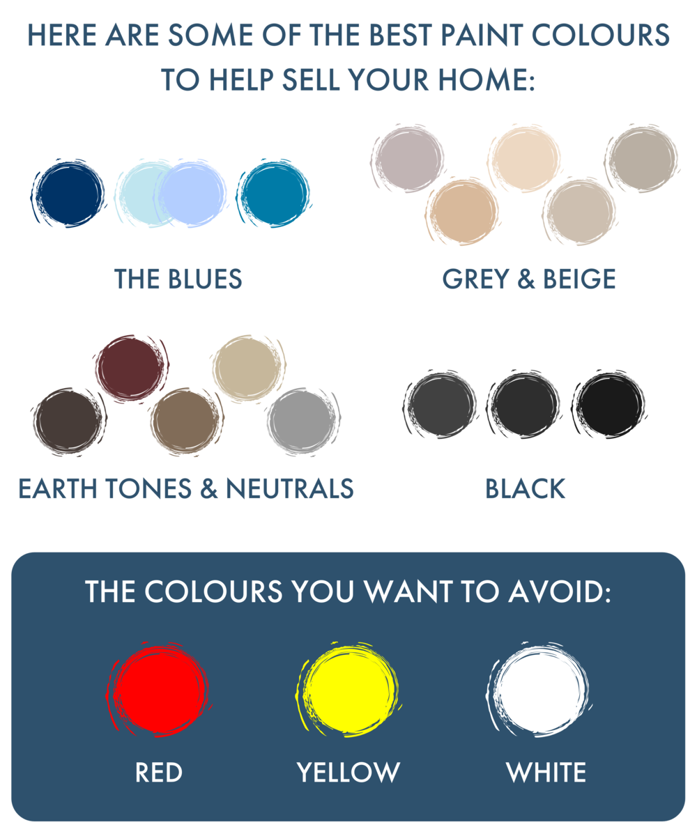
THE BLUES
Blue proves to be the colour of royalty! Zillow found that different shades of blue in your home are correlated with higher sales prices:
– A navy blue front door could add as much as $1,514 to the sales price of your home, and painting your front door is one of the cheapest projects you can do to upgrade the look of your home!
– A light pale blue to a periwinkle blue paint is a popular option for bathrooms, and increases the average selling price of a home by $2,786.
– Cerulean or cadet blue is a great choice for bedrooms!
GREY & BEIGE
“Greige” is a trendy colour that is the offspring of light grey and warm beige. It’s a neutral colour that will work well with most types of furniture, textile, and other furnishings. It helps create a modern-day classic feel in any home and is also a safe colour when it comes to staging. Zillow reports that greige-coloured homes saw as much as $3,496 more than the expected price of the home.
EARTH TONES & NEUTRALS
Don’t neglect the neutral colours, even if they look boring on swatches. Zillow believes that homes with neutral colours simply have wider appeal for minimalists and maximalists alike, and it could be a signal that a home has other desirable features. Homes with light taupe living rooms, particularly with tan, peach or pink undertones, sell for more than what is expected.
BLACK
You can accentuate the colour black when you use it for your front door, or opt for black kitchen islands with white cabinets.
THE COLOURS YOU WANT TO AVOID:
The colours that could be harmful to your home’s sale price include:
- Yellow – Specifically for the kitchen. Homes in this colour reportedly sell for $3,408 less than expected, according to the Zillow report. Even homes with brown walls with yellow undertones sell less than expected.
- Red – Avoid bright reds, especially in the dining room and kitchen; instead, opt for something closer to a burgundy or rust colour.
- White – Surprisingly, bathrooms painted in plain white sold for $4,035 less on average.